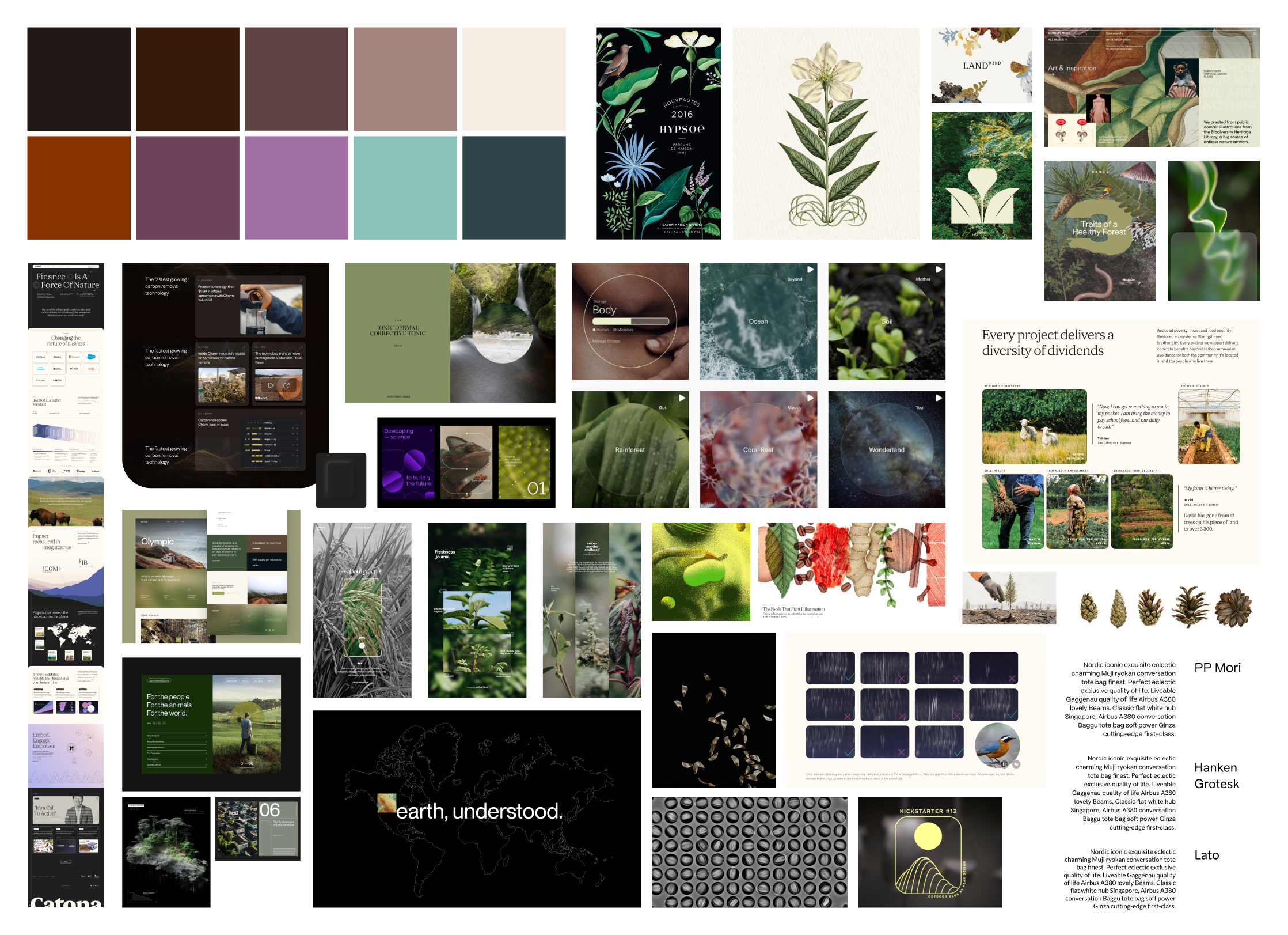
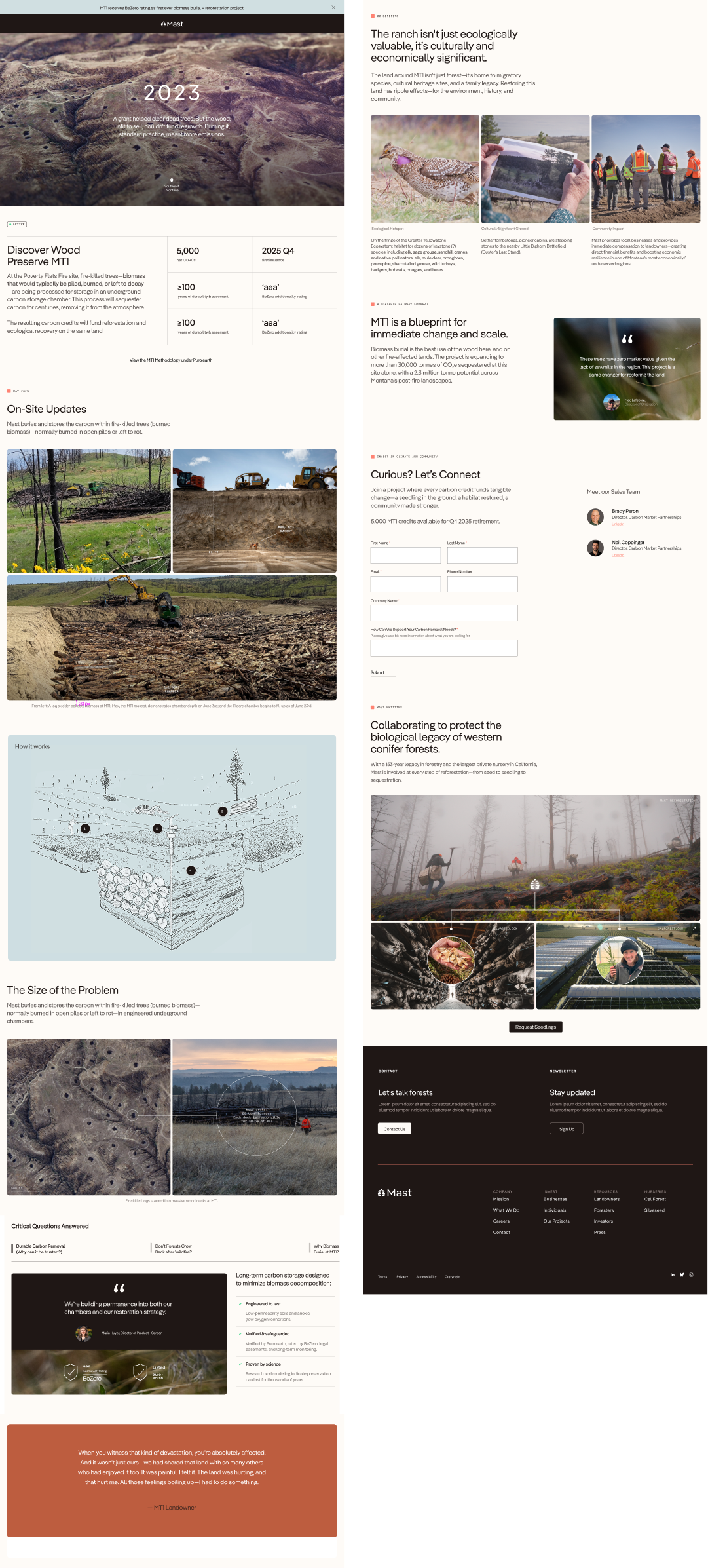
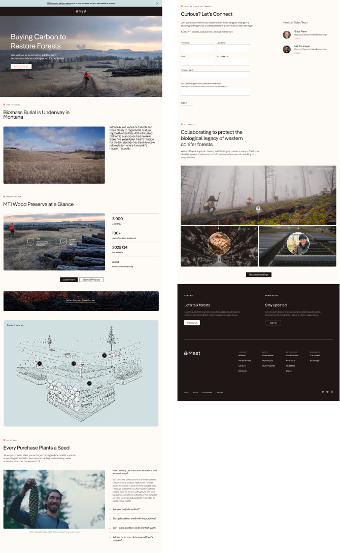
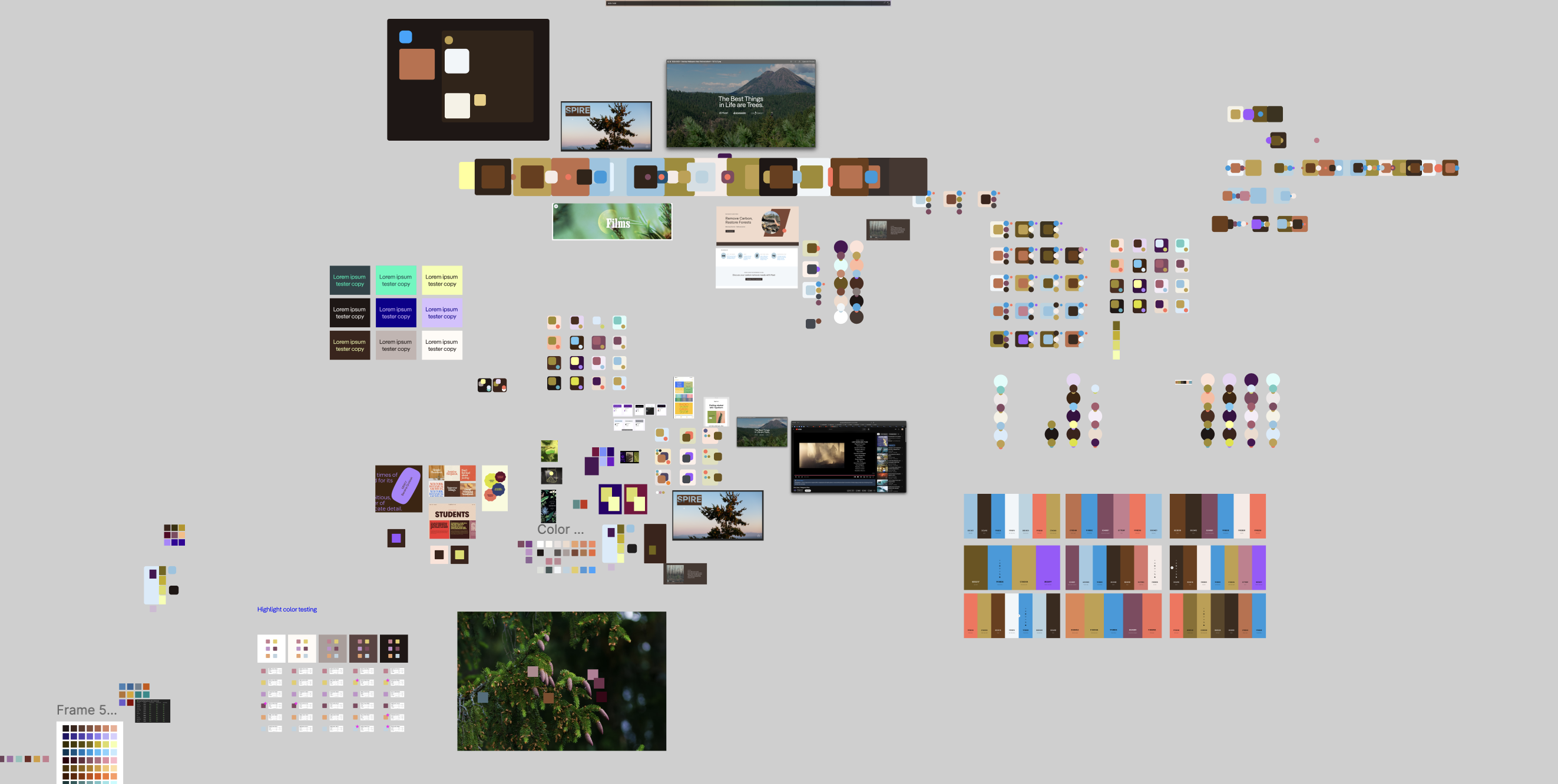
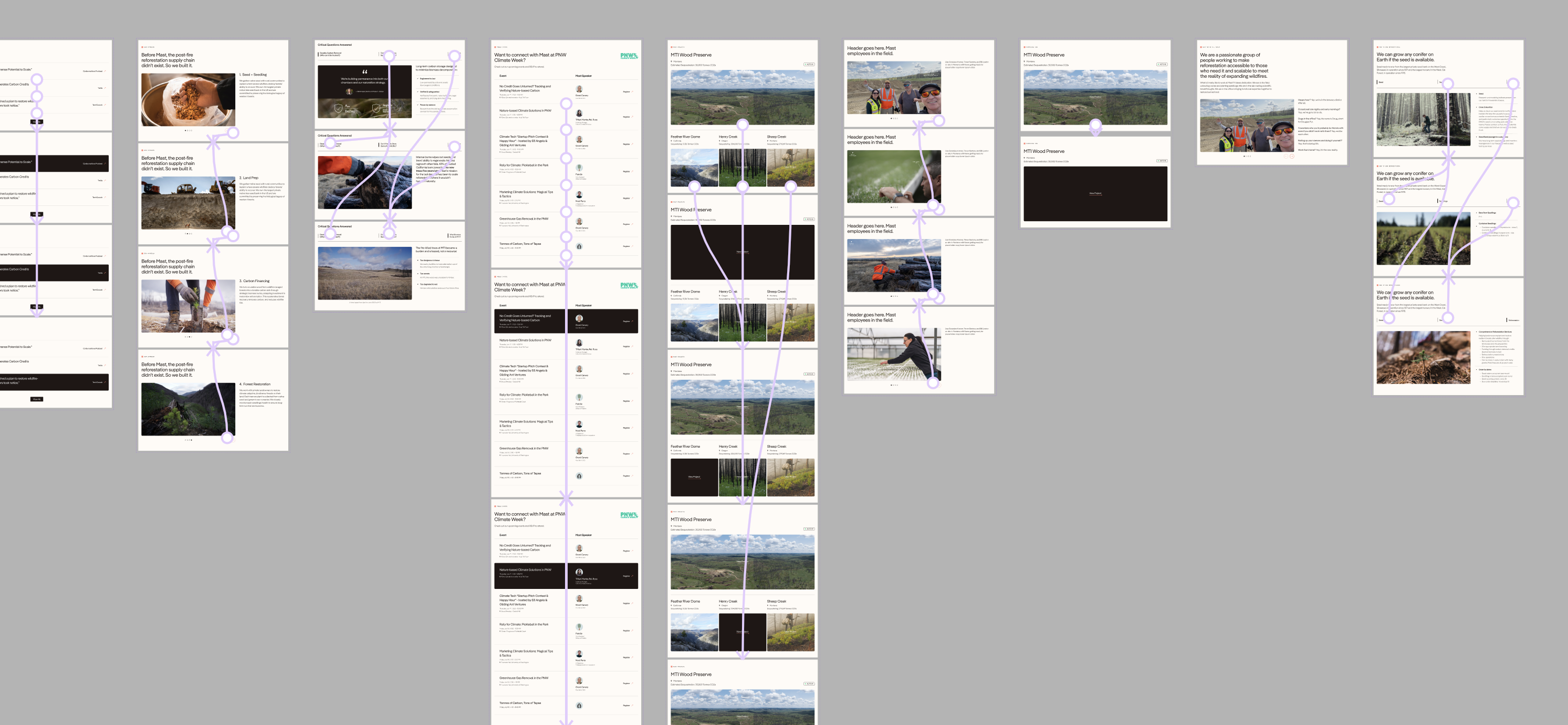
MAST REFORESTATION // CLIENT WORK

Scalable designs for scalable forest restoration.

Overview

At Mast Reforestation, I contribute to a wide range of design initiatives aimed at strengthening brand presence and improving user experience across platforms. I have conducted heuristic and visual audits to identify opportunities for optimization, directly informing new user flows and a full website refresh. Currently, I am leading the development of prototyped, high-fidelity wireframes in Figma and collaborating closely with a developer to implement the redesign in HubSpot, ensuring alignment with updated brand direction and creating a more cohesive, accessible experience across breakpoints.

In addition to web work, I design print and digital materials including investor reports, event signage, social media content, promotional mailers, and multi-platform ad campaigns. These pieces blend clear visual communication with brand storytelling to engage diverse audiences, from carbon buyers and investors to field partners and the general public. Across all touchpoints, I focus on creating thoughtful, visually consistent design that supports Mast's mission and drives meaningful engagement.

About Mast

Mast Reforestation is a climate tech company focused on large-scale forest restoration in the Western United States. It integrates seed collection, nursery operations, planting, biomass burial, and carbon finance to restore land after severe wildfires. Backed by leading climate-focused investors, Mast works with landowners, agencies, and carbon buyers to support long-term ecosystem recovery and climate resilience.

Deliverables

UX/UI Design
Digital Media
Brand Design
Print
Environmental Design

Keywords

Credible
Purposeful
Human-centered

Completed

Client Work
Ongoing

MOODBOARD
Creating space for new growth.

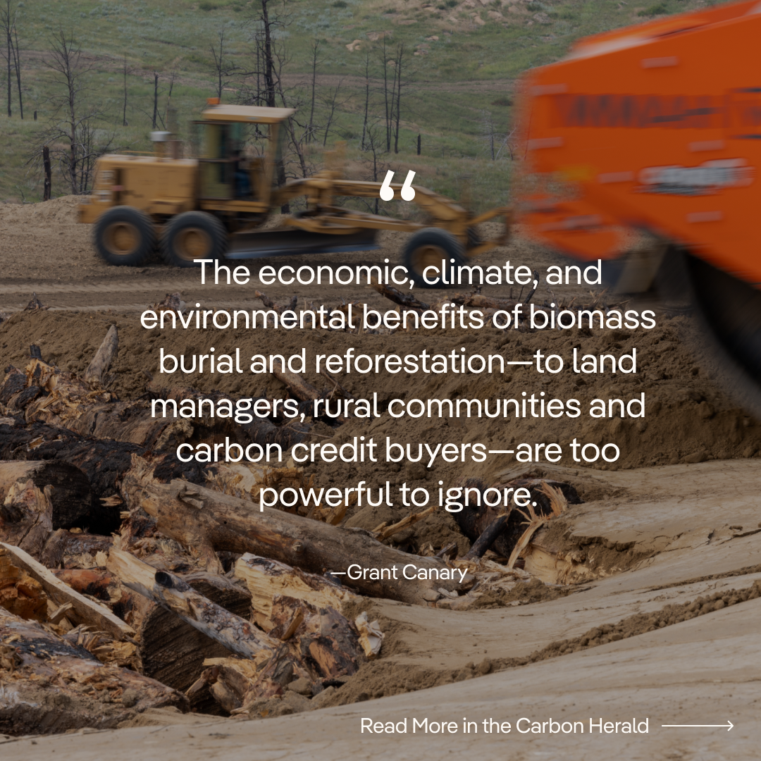
In the early stages of my time with Mast, it was decided that the brand along with the website, needed a refresh in order to further legitimize its new carbon work and attract more buyers in that space. The goal was to amp up the sophistication of the brand while still maintaining a humanist touch that evoked the spirit of nature.

Blending earthy tones, humanist type, clean lines, and structured layouts, this moodboard reflects the brand’s ecological mission through style and substance. The visual system is designed to feel grounded, credible, and approachable—balancing storytelling with clarity and consistency across the site.

WEB
Strategic Storytelling at Scale

This website redesign transformed dense field data into a clear, narrative-driven experience for investors, regulators, and partners. Every design choice supported consistency, usability, and trust. Reusable components were created to reduce development time and maintain visual consistency across pages. This system also established clear patterns for users, making the site intuitive and scalable. The warm, nature-inspired color palette, humanist type, and documentary-style photography were chosen to evoke connection, credibility, and care. The result is a flexible design system rooted in strategy and purpose.

Process shot of color palette work, inspiration, and strategy.
Detailed spacing and styling specs ensured visual consistency across the site, guiding the developer with precise rules for hierarchy, rhythm, and media treatment.
High-fidelity Figma prototypes mapped key user flows to validate functionality and hierarchy early, aligning teams and reducing developer guesswork before handoff.
PRINT
Turning field data into confident storytelling.

These project overview flyers were designed to communicate reforestation progress to investors, carbon buyers, and regulatory bodies. The challenge was translating raw field data—like hectares serviced and species planted—into a format that felt organized, credible, and brand-aligned. I focused on clear hierarchy, restrained color use, and strategic layout to guide the reader through dense information without overwhelming them. Landscape imagery and on-site photography reinforce legitimacy, while branded elements bring cohesion across reports and regions. The end result is a template-driven system that scales across projects while maintaining clarity and visual impact.

Project summaries tailored for investor, verifier, and buyer confidence—rooted in clarity and brand cohesion.
SOCIAL
Translating complexity into clarity.

These social graphics were created to share key project updates and build credibility for Mast’s biomass burial approach—an emerging carbon removal strategy gaining rapid traction. The goal was twofold: to inform potential carbon credit buyers and investors of Mast’s momentum, and to establish legitimacy through visual consistency and strategic social proofing. Bold type hierarchy, compelling stats, and grounded photography work together to simplify complex science, signal trust, and stop the scroll.

More Projects

Opaline

E-COMMERCE, PRODUCT DESIGN, UI/UX, EMAIL MARKETING

Tendril

EDITORIAL, NAMING, BRAND DESIGN