CYCOGNITO REBRAND

Redefining reliability where it matters most.

Overview

CyCognito is a B2B cybersecurity SaaS company with revolutionary technology that helps businesses better protect their web assets.

In the cybersecurity industry, reliability and trustworthiness are paramount. Currently, the CyCognito website is laden with pop-up windows, pixelated photography, and underbaked copy in a lackluster typeface. All of this paired with a color system that mirrors almost every one of their competitors, CyCognito falls short of the professional look and feel their customers require while simultaneously failing to stand out amongst the competition.

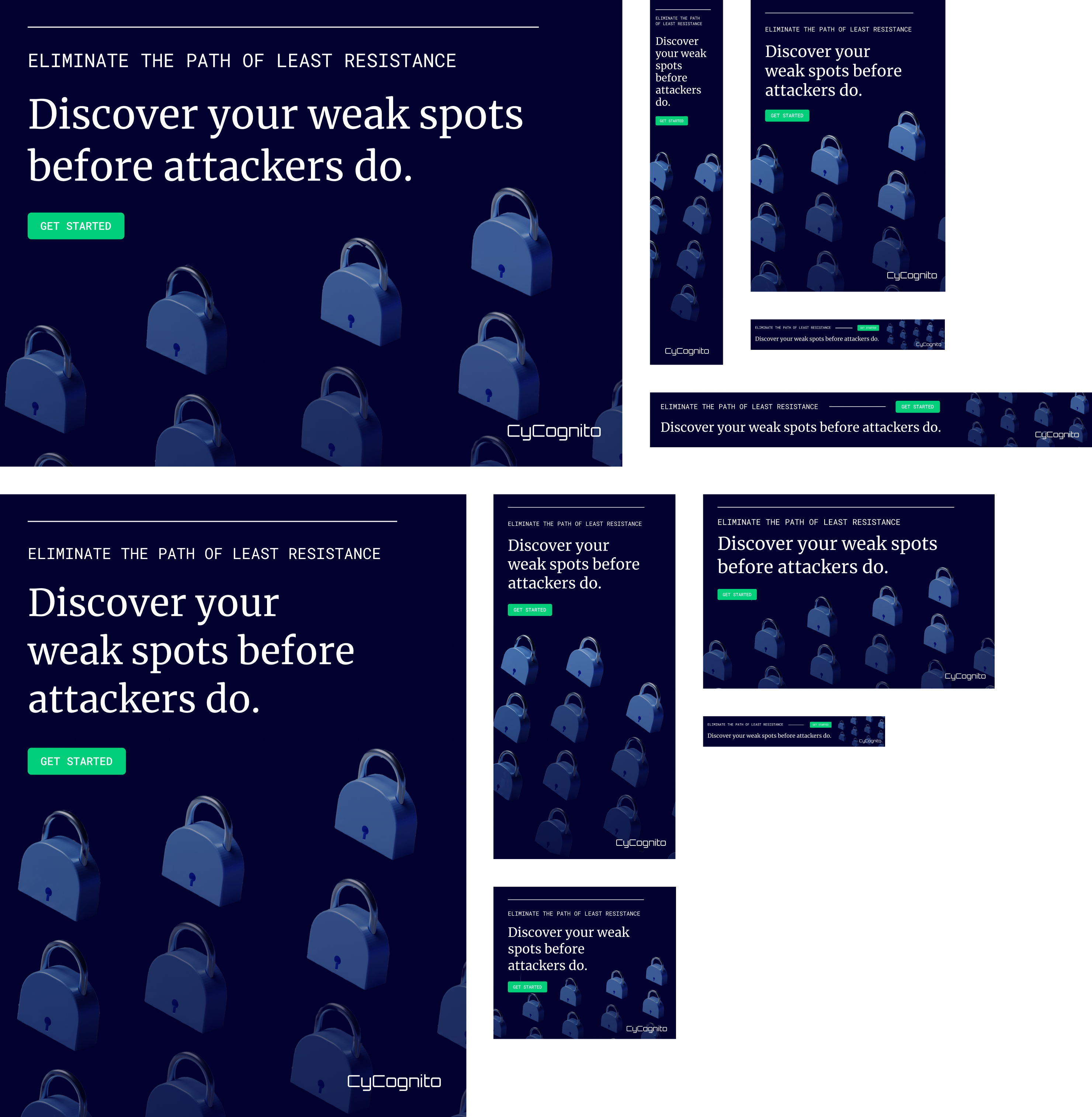
In order for the company brand to match the advanced and innovative software of the company itself, a website refresh was proposed. Digital ads were also created to expand brand visibility. The challenge was to create a unified aesthetic that was aligned with the cybersecurity industry while standing out from competitors and maintaining brand equity.

Deliverables

Website Design
Digital Ads
Brand Design

Keywords

Sleek
Professional
Reliable‍

Completed

Student Project
Spring 2024

PROCESS
Auditing the current brand and its competitors.

After conducting a competitive audit, two clear patterns emerged. The first being that all, CyCognito included, utilize very similar color palettes with orange being the main highlight or callout color. Second, the website designs lack cohesive direction. Many pages are overwhelmed with text, while the typography choices feel unrefined or overly simplistic. Imagery often appears outdated, misaligned with the brand, or fails to capture attention.

MOODBOARD
Cracking the <code/>.

In order to stay on brand within the cybersecurity industry while standing out among competitors, a "terminal green" accent color and a monospaced typeface were chosen to act as nods to cyberspaces of the past. These changes were combined with a streamlined, modern design free of pop-up callouts and underwhelming copy and imagery. This new design direction creates a brand that is more recognizable, memorable, and easy to trust.

WEBSITE DESIGN
A cohesive look and smooth user flow.

Subtle animation and graphic elements add visual interest without overwhelming customers.  The inviting and technical font selections, Merriweather and Roboto Mono respectively, reiterate the brand’s blend between trustworthy and professional, while incorporating a technology-forward tone.

More Projects

Center for Collaborative Design

BRAND DESIGN

Tendril

EDITORIAL, NAMING, BRAND DESIGN